People remember how a site makes them feel. If it is fast, clear, and forgiving, they trust it. If it is slow or confusing, they bounce and rarely come back.
Designing for joy is not magic. It is a set of simple choices made on purpose. This guide shows the choices that matter most.
Start With Real People
Before pixels, learn what visitors need to finish. Ask what they hope to do, what they fear, and what success looks like. Write those answers in plain language.
Listen for words your audience uses. Mirror that language in menus, buttons, and help text. Keep the tone friendly and direct.
Create 1 or 2 lightweight personas. Give each a goal, a constraint, and a device. Use them to sanity check every page.
Make Speed A Feature
Speed is respect for your users’ time, so treat it like a feature you design and ship. Remove code, images, and effects that do not serve the main task, then compress what remains until it feels light. Optimize images and fonts, use modern formats with caching, and keep the critical path small.
Tame third-party scripts because they are often the biggest slowdown. Load them async or defer them, lazy load media below the fold, and prefetch what the next page will need. Reserve space for images and ads to prevent layout shifts that make people chase buttons.
Test on mid-tier phones and shaky networks, not just your perfect laptop on office Wi-Fi. If it feels quick on 3G, it will fly on fiber, and that confidence shows.
Choose The Right Domain And Hosting
A good name helps people remember you. Keep it short, readable, and hard to mistype. Avoid clever spellings that break word of mouth.
Set a small yearly budget for ownership basics. Check domain prices so you know what extensions and renewals will cost, then pick hosting that fits traffic today. Leave room to add email, backups, and a CDN.
Turn on automatic renewals and alerts. Add DNS records with care and document changes. Use SSL everywhere and keep it current.
Keep Navigation Obvious
People scan first, so make the path clear at a glance. Use a simple top menu with plain labels that match the words people use, and place the primary action where eyes naturally land. Keep patterns consistent across pages so the experience feels calm and learnable.
Always show where someone is and how to go back. Use breadcrumbs on deeper pages, highlight the current section in the menu, and keep the search box easy to find with helpful results.
Give the footer a real job rather than a link dump. Add key links, contact details, and policies, and include help or language options where relevant. Treat it as the safety net that catches lost users and the quiet guide that reassures everyone else.
Plan For Costs And Ownership
List your steady costs up front. Include the domain, SSL, hosting tier, bandwidth, email, and any paid integrations. Small fees add up.
A 2024 update from the U.S. telecom agency noted that .com prices are capped near $10 per year, with up to 7% increases allowed in 4 of the next 6 years, so plan for renewals that may rise. Treat this like a utility bill that needs a buffer. No one enjoys surprise invoices.
Pick durable tools. Choose frameworks and services that will still be around in 3 years. The cheapest option today can be the most expensive to maintain.
Design For Accessibility From The Start
Start with a strong color contrast and type that is easy to read at common sizes, then adjust with real content and real devices. Use headings in a logical order so assistive tech can map the page. Good structure helps everyone, not just screen reader users.
Write alt text that explains purpose, not decoration, and give every form field and button a clear label. Check that the entire flow works with a keyboard alone, including modals and menus. If a key task stalls without a mouse, the design needs another pass.
Do not rely on color alone to show errors or states. Pair red or green with text, icons, or patterns so meaning survives monochrome or color blindness. Run a quick screen reader test and fix what it uncovers before shipping.
Craft Clear Forms And Microinteractions
Ask only for the data you truly need to complete the task, and group fields in a natural order that matches how people think. Offer real-time hints for formats so users do not guess at what you want. Fewer surprises make forms feel shorter.
Validate inputs inline and explain problems in plain language right next to the field that needs attention. When formats are tricky, show an example and accept common variations where possible. Helpful errors turn confusion into quick fixes.
Mark success with small, respectful moments so the interface feels responsive without getting noisy. A subtle checkmark, a short confirmation, or a smooth transition adds reassurance. Microcopy and motion together make the product feel alive.
Build Trust With Feedback And States
Buttons should look pressable, react on hover, and show a clear loading state as work happens. People relax when the interface narrates progress. If they have to wonder, they will click twice or leave.
Design empty states to guide rather than scold. Provide a short tip, a helpful link, or a sample item that shows what good looks like. Teaching moments here reduce support tickets later.
Where it makes sense, let people save drafts, undo, or revert to a previous version. Safety nets invite exploration because mistakes are low risk. The product feels kinder when it is hard to break.
Measure, Learn, And Iterate
Choose one north star metric that reflects real success, like completed tasks or repeat visits, and make it visible to the team. Track drop-offs by page and by step so you can see where effort leaks away. Numbers point to the next design conversation.
Ship small changes often and watch how behavior shifts. A modest tweak to copy or spacing can unlock a big lift in completion. Keep a lightweight template for change notes so learning compounds.
Recheck speed, clarity, and access each quarter as content grows and features creep in. These basics drift without steady care, and fixing them early is cheaper than a redesign. Tune the foundation before you add more.
Good websites feel easy because the team did the hard work first. They reduced choices, raised the floor on quality, and centered every decision on what visitors need to finish.
Use this checklist mindset as you build and maintain. When you are unsure, make it simpler, faster, and clearer. People will feel the difference and come back.
Designing Websites People Actually Enjoy Using was last modified: February 4th, 2026 by Pete Brown
In today’s digital-first economy, a company’s website is often the first and sometimes only interaction a potential customer has with the brand. It’s not just a digital brochure; it’s a sales channel, a credibility signal, and a core growth asset. When web design falls short, the consequences are immediate and measurable: lower conversion rates, higher bounce rates, and lost trust.
What makes web design particularly challenging for business leaders is that many growth-killing mistakes are subtle. A site may look “fine” at a glance yet quietly undermine marketing efforts and sales performance. This article breaks down the most common web design mistakes that limit business growth, explains why they matter, and provides practical, non-technical solutions decision-makers can act on.
Foundational Website Issues That Undermine Performance
Before diving into specific design flaws, it’s important to understand a core principle: effective web design is not about aesthetics alone. It sits at the intersection of usability, psychology, branding, and performance. When these fundamentals are overlooked, even well-funded marketing campaigns struggle to produce results.
Many businesses inherit websites that were built quickly, pieced together over time, or designed without clear ownership. In these cases, working with a qualified web design and development company can help identify structural issues that aren’t obvious to non-technical stakeholders. However, even without rebuilding a site from scratch, leaders can make informed improvements by understanding where things typically go wrong.
Below are the most common web design mistakes that actively hold businesses back and how to fix them.
Poor Mobile Responsiveness
Why It Hurts Business Growth
Mobile traffic now accounts for well over half of global web usage. When a website is not designed with mobile users in mind, it creates friction at the very moment users are evaluating whether to stay or leave.
Common mobile issues include:
Text that is too small to read
Buttons that are difficult to tap
Content that requires horizontal scrolling
Forms that are frustrating to complete on smaller screens
Search engines also prioritize mobile-friendly sites, meaning poor responsiveness can reduce visibility and organic traffic in addition to harming user experience.
Real-World Impact
A business may see strong desktop engagement but wonder why paid ads or social campaigns underperform. The issue often lies in mobile experience: users click through, struggle to navigate, and abandon the site within seconds. This leads to wasted ad spend and missed opportunities.
Actionable Fix
Adopt a mobile-first design approach:
Design layouts for smaller screens first, then scale up
Use responsive grids and flexible images
Ensure tap targets are large enough and well spaced
Test key user flows (contact forms, checkout, booking) on multiple devices
Mobile usability should be treated as a core business requirement, not an optional enhancement.
Slow Loading Speed
Why It Hurts Business Growth
Speed directly affects conversions, engagement, and trust. Users expect pages to load in seconds; delays create frustration and signal inefficiency. Research consistently shows that even a one-second delay can significantly reduce conversion rates.
Slow sites also perform worse in search rankings, compounding the problem by reducing traffic quality and quantity.
Real-World Impact
A visually rich homepage may impress internal stakeholders but drive users away if it takes too long to load. High bounce rates are often misattributed to poor messaging when the real issue is performance.
Actionable Fix
Focus on performance optimization:
Compress and properly size images
Minimize unused scripts and plugins
Use modern file formats and caching
Choose reliable hosting with adequate resources
Speed improvements are often incremental but cumulative, and even modest gains can produce noticeable improvements in engagement.
Confusing Navigation and Information Architecture
Why It Hurts Business Growth
Navigation is the backbone of user experience. When visitors can’t quickly find what they’re looking for, they assume the site or the business is not well organized.
Common navigation problems include:
Overcrowded menus
Vague or jargon-heavy labels
Inconsistent page structure
Important pages buried too deeply
These issues increase cognitive load and reduce the likelihood that users will reach conversion points.
Real-World Impact
Potential customers may land on a site interested in a specific service but leave because they can’t easily locate relevant information. Internally, teams may compensate by adding more pages, unintentionally worsening the problem.
Actionable Fix
Simplify and clarify:
Limit top-level navigation items to core categories
Use clear, user-centered language
Group related content logically
Ensure key pages are reachable within one or two clicks
Navigation should reflect how customers think, not internal organizational charts.
Weak Visual Hierarchy
Why It Hurts Business Growth
Visual hierarchy guides users’ attention. Without it, pages feel chaotic, and important messages compete with less critical elements. Users don’t know where to look first, so they often disengage.
Symptoms of weak hierarchy include:
Uniform text sizes
Overuse of bold or color
Poor spacing between sections
No clear focal points
Real-World Impact
A landing page may contain all the “right” content but still fail to convert because users can’t quickly understand the value proposition or next step.
Actionable Fix
Create intentional structure:
Use size, contrast, and spacing to emphasize key messages
Establish a clear primary headline and supporting subhead
Group related elements visually
Limit competing calls to action on a single page
Effective hierarchy reduces friction and helps users move confidently through the site.
Lack of Trust Signals
Why It Hurts Business Growth
Trust is a prerequisite for conversion, especially for businesses asking users to share personal information or make purchases. A site that feels unproven or anonymous creates hesitation.
Missing trust signals often include:
No testimonials or reviews
Lack of recognizable clients or partners
No clear contact information
Outdated or generic “About” content
Real-World Impact
Even strong offers fail when users don’t feel confident in the brand behind them. This is especially damaging for service-based businesses and B2B companies with longer sales cycles.
Actionable Fix
Reinforce credibility throughout the site:
Add real testimonials with names and roles
Highlight certifications, awards, or media mentions
Make contact details easy to find
Clearly communicate who the company is and what it stands for
Trust should be built proactively, not left to chance.
Outdated Design Aesthetics
Why It Hurts Business Growth
Design trends evolve because user expectations evolve. An outdated site doesn’t just look old it signals that the business may also be outdated, inattentive, or less competitive.
Visual red flags include:
Heavy textures or gradients
Stock imagery that feels generic or staged
Inconsistent typography
Designs that don’t reflect current brand positioning
Real-World Impact
Prospective clients may judge the business within seconds and choose a competitor whose website feels more modern and aligned with current standards even if the underlying offering is similar.
Actionable Fix
Modernize with intention:
Refresh typography and color palettes
Use authentic imagery or custom visuals
Maintain consistent branding across pages
Prioritize clarity and simplicity over decoration
Modern does not mean trendy; it means relevant, clean, and user-focused.
Poor Call-to-Action (CTA) Placement and Clarity
Why It Hurts Business Growth
A website without clear calls to action leaves users guessing what to do next. Even interested visitors may leave if the path forward isn’t obvious.
Common CTA mistakes include:
Vague wording (“Learn More” everywhere)
CTAs hidden below the fold
Too many competing actions
Inconsistent placement across pages
Real-World Impact
Marketing campaigns may drive traffic successfully, but conversions remain low because users aren’t guided toward a specific outcome.
Actionable Fix
Design CTAs strategically:
Use action-oriented, specific language
Place primary CTAs prominently and repeatedly
Align CTAs with user intent on each page
Reduce distractions around conversion points
Every key page should have a clear purpose and a clear next step.
Inconsistent Messaging and Design Elements
Why It Hurts Business Growth
Consistency builds familiarity and trust. When design elements, tone, or messaging vary widely across pages, users feel disoriented and uncertain.
Inconsistency often shows up as:
Different button styles
Shifting brand voice
Uneven layout patterns
Contradictory messaging
Real-World Impact
Users may question the professionalism or legitimacy of the business, particularly if inconsistencies resemble common scam patterns or low-quality sites.
Actionable Fix
Establish and follow standards:
Create a simple design system or style guide
Standardize fonts, colors, and components
Align messaging with brand values and audience needs
Regularly audit the site for drift over time
Consistency doesn’t limit creativity it reinforces clarity.
Conclusion: Designing for Sustainable Business Growth
Web design is not a one-time project or a purely visual exercise. It’s a strategic business tool that directly influences how customers perceive, trust, and engage with a brand. The mistakes outlined above are common not because businesses are careless, but because web design spans multiple disciplines that require intentional coordination.
The good news is that most growth-limiting design issues are fixable without dramatic overhauls. By focusing on usability, performance, clarity, and trust, businesses can turn their websites into reliable growth engines rather than silent liabilities.
For decision-makers, the key takeaway is this: a well-designed website doesn’t just look professional it works relentlessly in the background to support marketing, sales, and long-term credibility. Investing in thoughtful, user-centered design is not a cosmetic upgrade; it’s a strategic move with compounding returns.
Common Web Design Mistakes That Hurt Business Growth (And How to Fix Them) was last modified: January 27th, 2026 by John Allen
Call it a trend. Call it a strategy. Call it digital sprawl. Whatever you call it, entrepreneurs in 2025 are launching more stores, not fewer and they’re doing it on purpose.
We’re seeing the rise of single-product stores, dedicated microsites for limited launches, and spinoff storefronts that focus on one category at a time. It’s not a tech glitch or marketing mistake, it’s a real, intentional move toward brand fragmentation with focus. And it’s working.
Why run one big brand when you can own multiple small hits? Why cram 30 SKUs under one roof when each deserves a stage? It’s harder to come up with a Shopify store name than build a store.
This isn’t overbuilding, it’s strategic segmentation, and smart entrepreneurs are cashing in.
Focus Sells: The Rise of the One-Product Store
One hero product. One site. One clear message.
Entrepreneurs are leaning into hyper-focused storefronts that sell a single item or variation, a portable blender, a specialized planner, a “perfect” towel. Why? Because simplicity drives conversion. No distractions, no product overwhelm, no explaining what the site is for. The answer is clear before the page loads.
A dedicated storefront gives each product its own voice, its own vibe, and its own marketing funnel. You can tell a deeper story, test pricing and angles, and speak directly to that product’s most loyal niche. And when it hits? You scale it. Or sell it.
Brand Architecture Gets Modular
We’re moving beyond the “everything under one brand” model. Creators are building modular brand portfolios, each site serving a purpose, a mood, a vertical. One store for skincare. One for the nighttime collection. One for your collabs. One for your weird little passion project that somehow outsells everything else.
You don’t need to stretch a brand voice to fit everything. You give each line its own room to breathe.
Need to run a seasonal campaign? Launch a dedicated store. Want to test a viral TikTok product? Build a landing page in two hours. It’s lean brand thinking: small launches, fast tests, low risk.
Scarcity = Sales: The Power of Limited Drops
The limited-edition drop model is no longer just for fashion. Entrepreneurs are using time-limited storefronts to create urgency and customers are responding.
A product that’s only live for 10 days? You build hype, you launch hard, and then you shut it down. That kind of rhythm keeps your audience engaged, gives people a reason to return, and frees you from always-on inventory stress.
Drops work best when paired with their own dedicated site, think clean, stripped-down, all eyes on the offer. You can go big on storytelling without crowding your evergreen brand.
Why It Works Today
This whole wave – single-product stores, modular microsites, limited drops – it’s not just trend-chasing. It’s working because of the way people shop now:
And thanks to no-code tools, AI copy, and instant Shopify themes, launching a new storefront doesn’t take months. It takes a weekend – maybe a few hours.
The Future Isn’t One Big Store. It’s a Network of Them.
Entrepreneurs are thinking in ecosystems, not empires.
They’re building product lines like portfolios, where each product gets its own spotlight. They’re running experiments at scale, with multiple stores testing audience, offer, and pricing in parallel. They’re playing fast, smart, and segmented.
In a world where customer attention is fragmented, entrepreneurs are fragmenting their brands to meet them where they are. Clean, clear, and niche.
More stores, less noise.
More launches, less bloat.
More wins, one at a time.
Why More Entrepreneurs Have More Than One was last modified: January 14th, 2026 by Barbara Zomo
A professional online presence is now essential for businesses, freelancers, and creatives in the digital world. However, not everyone has the technical skills or financial means to hire professional web developers. This shift has changed how entrepreneurs develop their digital strategy, pushing many toward solutions that blend professionalism with accessible technology. Modern web development prioritizes efficiency while maintaining quality, allowing individuals to build their brand identity on their own. Knowing the full benefits of these platforms helps decision-makers select the best solution while maximizing their digital investment.
Why Non-Technical Entrepreneurs Are Embracing Website Builders in 2026
The entrepreneurial landscape has shifted dramatically, with startup founders and small business owners recognizing that technical barriers should never prevent market entry. Modern platforms eliminate the steep learning curve traditionally associated with web development, offering intuitive interfaces that translate creative vision into functional reality. Anyone researching top-rated options for small business website creation quickly discovers that professional templates now rival custom designs in both aesthetics and functionality.
Cost Efficiency and Budget Management
Financial considerations remain paramount for emerging businesses, as these ventures must carefully balance limited budgets while establishing themselves in competitive markets where resources are often stretched thin. Traditional web development projects, which have long been the standard approach for businesses seeking an online presence, often require substantial upfront investments that can be financially burdensome, sometimes reaching thousands of dollars before the business has any opportunity to generate even a modest return on that considerable initial expenditure. Accessible alternatives use predictable subscriptions for strategic resource allocation.
Speed to Market Advantages
Launching quickly can determine competitive success, as businesses that bring their products or services to market faster often gain a significant advantage over slower-moving competitors in their industry. While conventional development timelines, which typically involve extensive planning, coding, and testing phases, stretch across many months of dedicated work, modern self-service platforms, designed with user-friendly interfaces and pre-built templates, enable complete website deployment within mere days or even hours, dramatically accelerating the path from concept to launch.
Built-In SEO and Analytics Features That Drive Organic Traffic
Visibility determines digital success, making search engine optimization capabilities essential rather than optional. Contemporary platforms integrate sophisticated SEO tools directly into their frameworks, democratizing techniques previously reserved for marketing specialists. A comprehensive website builder typically includes meta tag editors, URL customization, image optimization, and structured data implementation without requiring manual coding.
Integrated Performance Tracking
Understanding visitor behavior transforms marketing effectiveness. Built-in analytics dashboards reveal traffic patterns, popular content, conversion funnels, and user engagement metrics through accessible visualizations. Owners can track leads, drop-offs, and traffic sources.
Mobile Optimization Standards
Search engines prioritize mobile-friendly websites, so responsive design is essential for ranking success. Modern platforms, which have been specifically designed to address the growing demands of mobile users, automatically generate mobile-optimized versions of websites, thereby ensuring that users enjoy consistent and seamless experiences across all devices, including smartphones, tablets, and desktop computers, without requiring any additional effort from website owners or developers.
E-Commerce Integration Made Simple for First-Time Online Sellers
Selling products online requires specialized functionality that extends well beyond a basic web presence, as merchants need robust tools and features to manage their digital storefronts effectively. Payment processing, inventory management, shipping calculations, and tax compliance, which each demand specialized knowledge and careful attention to regulatory requirements, collectively create a level of operational complexity that frequently overwhelms many new sellers who are attempting to establish their first online retail ventures. Integrated e-commerce solutions address these challenges comprehensively:
Customization Freedom Without Writing a Single Line of Code
Visual design tools have evolved remarkably, offering granular control over every aesthetic element. Drag-and-drop editors enable precise positioning, color scheme customization, typography selection, and layout adjustments through intuitive interfaces. Users can maintain ongoing connections with their audience through regularly updated content sections, blog integration, and social media embedding features.
Template libraries offer foundational frameworks while still allowing complete flexibility for personalization and customization. Business owners can customize industry-specific designs to express their brand. Advanced platforms offer CSS injection bridging simplicity and sophistication.
Ongoing Maintenance and Updates Handled Automatically
Traditional websites demand ongoing maintenance for security patches, updates, and compatibility fixes. Self-managed hosting consumes time better spent on business. Platform-based solutions effectively transfer these critical responsibilities to specialized infrastructure teams, which ensures continuous protection and robust security maintenance without requiring any direct user intervention or technical oversight.
Security certificates, backup systems, and performance optimization all happen invisibly behind the scenes, working continuously to protect your website without requiring any manual intervention or technical oversight from you. When new browser standards emerge from the ever-evolving technological landscape or critical security vulnerabilities suddenly appear and threaten website integrity, comprehensive updates deploy automatically and seamlessly across all hosted sites, ensuring continuous protection without requiring manual intervention from site administrators. This maintenance automation eliminates unexpected downtime while ensuring business continuity remains fully intact.
Your Path to Digital Independence Starts Here
The remarkable transformation from an initial concept to a truly compelling and professional online presence, which was once considered a challenging endeavor reserved for experts, no longer requires specialized technical knowledge or substantial financial investment from those who wish to establish themselves digitally. Modern website creation platforms deliver professional results using accessible tools designed for non-technical users. These solutions provide the foundation for sustainable online success, whether launching a business, showcasing portfolios, or expanding retail digitally. Starting your digital identity has never been easier or more rewarding.
What Are the Benefits of a Website Builder? was last modified: January 12th, 2026 by Recep Karaca
Your online store gets about three seconds to make an impression. Poor design choices cost you customers every single day. Most Ecommerce business owners need fresh graphics, updated product images, and polished branding materials. But hiring a full-time designer comes with hefty salaries and overhead costs.
Most of the businesses save significant time when they bring specialized support on board for creative tasks. EcomVA offers a different approach. Their design services virtual assistant team handles everything from logo creation to complete website layouts without the traditional employment burden. Read on to learn more:
What Exactly Does a Virtual Assistant Graphic Design Professional Handle?
A graphic design virtual assistant brings specialized skills to your business remotely. These professionals manage all visual elements that customers see when they visit your store.
Their responsibilities cover multiple areas:
Brand Identity Work: Logo creation, color scheme matching, typography selection
Marketing Materials: Social media graphics, email templates, promotional banners
EcomVA’s Web Design Virtual Assistantteam understands Ecommerce platforms specifically. They know what works on Shopify, what converts on Amazon, and what engages customers on WooCommerce.
How Do Virtual Design Services Differ from Traditional Hiring?
Traditional hiring means posting jobs, reviewing hundreds of applications, and waiting weeks to fill positions. Virtual assistant services eliminate most of these headaches.
Speed of Deployment
EcomVA can match you with a virtual assistant graphic designer within days. No lengthy recruitment process or waiting periods.
Flexible Engagement Models
Some months you need 40 hours of design work. Other months, just 10 hours. You pay for productive hours, not idle time.
Lower Cost Structure
Full-time designers in the US command salaries between $50,000 to $80,000 annually. Add benefits and equipment costs. A graphic designer virtual assistant costs a fraction of that amount. EcomVA clients report saving up to 75% on operating costs.
Access to Diverse Skills
Virtual assistant teams bring specialists for each area:
Logo designers for brand identity
Web designers for layout optimization
Product photographers for image enhancement
Marketing graphic creators for promotional content
What Should You Look for When You Hire Graphic Designer Support?
Not all virtual assistant graphic design services deliver the same quality. Smart Ecommerce owners evaluate several factors before committing.
Portfolio Quality: Look for designs similar to what your brand needs. Previous work samples reveal actual capabilities.
Ecommerce Experience: Designing for online stores differs from general graphic work. Product images need specific formatting. Category banners require conversion-focused layouts.
Communication Standards: EcomVA maintains availability that matches US business hours. Quick responses keep work moving forward.
Tool Proficiency: Your virtual assistant should master Adobe Creative Suite, Figma, Sketch, and Canva based on your project requirements.
Revision Policies: Clear revision processes ensure you get exactly what you envisioned. EcomVA includes reasonable revisions in their service packages.
Why Are More Startups Choosing Virtual Assistant Graphic Design Services?
Startup budgets rarely accommodate full creative teams. Virtual design support offers the perfect solution for growing businesses.
New product launches need promotional graphics fast. A virtual assistant graphic designer can produce multiple versions for A/B testing. Store owners learn what resonates without major delays.
Key benefits include:
Quick scaling during holiday shopping seasons
More time for strategy instead of selecting fonts
Professional appearance that builds customer trust
Reduced operating expenses compared to traditional hiring
When you Hire Graphic Designer support, creative tasks move off your plate. Energy goes toward business growth instead. EcomVA has served over 350 Ecommerce businesses ranging from solo entrepreneurs to established stores.
What Services Does EcomVA’s Design Team Actually Provide?
EcomVA offers comprehensive visual support that covers every aspect of Ecommerce design needs.
Service Category
What’s Included
Typical Turnaround
Logo Design
Brand identity creation, color palette, multiple formats
3-5 business days
Website Design
Full layouts, mobile responsive, SEO-optimized
7-10 business days
Product Images
Photo editing, background removal, optimization
24-48 hours
Marketing Graphics
Social posts, email headers, banner ads
1-2 business days
● Logo Design Services
Your logo represents everything your brand stands for. EcomVA’s team creates designs that work across all platforms. They consider how logos appear on websites, social media profiles, and promotional materials.
● Website Layout Development
A web design virtual assistant structures pages for maximum engagement. Navigation flows logically. Mobile users enjoy the same quality experience as desktop visitors.
● Product Image Enhancement
Poor product photos kill conversions. Customers cannot touch items when shopping online. Images become their only reference point. EcomVA’s team ensures every product looks its absolute best.
How Does the Collaboration Process Actually Work?
Every project starts with understanding your vision. What message should the design communicate? Who is your target customer?
The process follows clear steps:
Initial Discussion: Share your requirements and expectations
Draft Delivery: First versions arrive according to agreed timelines
Feedback Round: You review and provide specific comments
Revisions: The graphic designer virtual assistant implements your suggestions
Final Delivery: Designs arrive in all necessary formats
Final files include PNG for web use, vector files for printing, and different sizes for various platforms. Future minor adjustments get handled quickly. The best results come from ongoing relationships where your virtual assistant graphic designer learns your brand preferences.
What Results Can You Expect from Virtual Design Support?
EcomVA clients report measurable improvements across multiple business metrics.
Faster Time to Market: Some stores cut their launch timelines by half after bringing virtual design support on board.
Higher Conversion Rates: Professional product images increase purchase confidence. Better website layouts guide visitors toward buying decisions. Stores often see conversion improvements between 15-30%.
Improved Brand Consistency: One team handling all visual elements ensures cohesive branding across every customer touchpoint.
More Time for Strategy: Business owners spend less time managing creative tasks. That time shifts toward planning growth and building customer relationships.
Ready to Transform Your Visual Presence?
Ecommerce success depends heavily on visual appeal. Customers judge your professionalism within seconds of landing on your site. When you hire graphic designer professionals through virtual assistant services, you solve this problem affordably.
EcomVA’s team brings creativity, technical skills, and Ecommerce expertise to every project. Their model eliminates the costs and commitments of traditional hiring. You get professional results at a fraction of typical expenses.
Over 350 Ecommerce businesses have partnered with EcomVA for their visual needs. These partnerships deliver measurable results: faster launches, better conversions, and reduced operating costs. Professional design support is no longer a luxury for big brands only.
Start reaping the benefits today. Connect with EcomVA to explore how their graphic design virtual assistant services can transform your Ecommerce presence in 2026.
Frequently Asked Questions
What types of design software do virtual assistants use?
Professional virtual assistants work with Adobe Photoshop, Illustrator, InDesign, Figma, Sketch, and Canva. EcomVA’s team stays current with the latest design software and techniques.
How quickly can a virtual design assistant start working?
EcomVA can match you with appropriate talent within 2-3 business days. Simple projects might begin immediately while complex ones require brief planning discussions.
Do virtual assistants understand Ecommerce-specific requirements?
Specialized services like EcomVA focus exclusively on online retail. Their team understands marketplace requirements, conversion optimization, and platform-specific design standards.
Can you hire graphic designer support for just one project?
Yes. EcomVA provides both short-term project support and ongoing monthly packages. Clients choose arrangements that fit their needs and budget.
What happens if your business needs change suddenly?
Virtual assistant graphic design services offer flexibility. You can increase hours during busy periods and reduce them during slower times. EcomVA adjusts to your changing requirements.
How do you ensure consistent brand standards?
EcomVA creates documentation of your preferred colors, fonts, image styles, and design approaches. This reference ensures every deliverable matches your brand identity.
Graphic Design Virtual Assistant Services: Creative, Fast & Scalable for 2026 was last modified: December 16th, 2025 by Lincoln Buirman
Many forget that a website is more of a web than a site. Every strand—your code, your content, your customer journey—is interwoven. A single weak thread can distort performance across the entire structure. Similarly, when custom-built with strategy and expertise, it becomes a valuable digital business infrastructure which can amplify visibility, trust, and growth far beyond your immediate reach.
A well-customized website becomes your business extension network that propagates ideas, connects people, and unlocks business possibilities even from the most geographically isolated or politically constrained corners of the map.
1. Facilitates Strategic Product and Service Clarity
Custom web design forces businesses to get brutally honest about priorities. You can’t hide behind generic templates or overcrowded pages.
Information Architecture (IA): Map content to real user goals, not internal convenience.
Focus on Key Offerings: Launching a new SaaS solution? Integrate an interactive demo scheduler to signal priority to both users and internal teams.
Empowered Teams: Marketing, sales, and support align around one clear story—no mixed messages.
Strategic Edge – Content Taxonomy: A structured content taxonomy prevents SEO keyword cannibalization. By designating a single authority page for a high-value term (e.g., “best digital marketing strategy”), internal linking funnels authority to that page, boosting rankings while avoiding wasted SEO effort.
Experts in web design in Liverpool NSW leverage clear brand strategy and user-centered design principles. This clarity turns a website into an internal compass and decision-making guide that unites teams and aligns operations.
2. Aligned and Harmonized Integration for Operational Efficiency
While a website’s appeal is interactively visual, its functional foundation is purely architectural. For example, a dedicated real estate agency leverages more than good online images; it requires a digital structure that precisely reflects property listings, complex client journeys, and internal sales workflows. This aligned and strategic design frees your team from digital chaos by creating an intelligent system with the responsiveness and adaptability necessary to meet your specific operational needs.
Tech Stack Harmony: Selected technologies must be able to work together; seamles integration with CRMs, ERPs, and automation tools.
Workflow Optimization: Streamlines, automates, and integrates a business’s internal operations while turning the public-facing website into a functional tool for the business.
Reduced Manual Burden: Free your people from tedious admin so they can focus on strategy, sales, and scale.
Strategic Edge – Headless Architecture: A decoupled “headless” CMS separates content from presentation—meaning faster load times, reduced costs, and instant scalability across mobile apps or kiosks. This is how modern digital ecosystems achieve omnichannel dominance and protect ROI under real-world pressure.
In short: your website stops being a cost center and becomes the invisible machine driving business momentum.
3. Audience-Centric UX and Conversion Engineering
Your website should anticipate human behavior, not just display content.
Persona-Led UX: Design around real pain points, behaviors, and desires.
Custom Conversion Funnels (CRO): Awareness → Interest → Desire → Action, optimized through A/B testing and analytics.
Scenario-Specific Copy: Real-life hooks like “How to select the best health insurance plan in under 10 minutes” meet users exactly where they are.
Cognitive Load Reduction: Breaking complex forms or processes into multi-step wizards reduces perceived effort, factually proven to increase completion rates and turn high-intent traffic into actual leads.
This approach converts curiosity into measurable action while providing clear insights into audience behavior and marketing ROI.
4. Prioritizing Custom Accessibility (A11y) for Market Advantage
While often viewed as a compliance measure, designing the custom website to exceed minimum Accessibility (A11y) standards is a significant competitive strategy. Factually, approximately 15% of the population has some form of disability. An accessible design dramatically expands your addressable market and creates goodwill.
More strategically, Google rewards superior A11y, as it is a core component of overall User Experience, boosting a site’s quality signals and protecting the business from costly web accessibility lawsuits. This ensures your digital asset grows with the business, maintains relevance, and communicates professionalism that strengthens client confidence.
Ultimately, your website should be a functional extension of your identity and mission— a double if we may say, that embodies your strategic intentions and brand personality. When people interact with it, they should feel a unique, curated experience that is authentically your brand. However, partnering with web design experts who understand that in today’s landscape, your business must look good online and think online.
Custom Web Design as a Strategic Compass for Your Business in Liverpool NSW was last modified: November 14th, 2025 by Jamesh B
Websites used to be built once and left alone. Maybe you updated the blog now and then, refreshed a hero image, or added a new product page when needed. But for AI-first startups, enterprise fintech platforms, and rapidly scaling medtech companies, that approach just doesn’t work anymore.
The rules have changed, and the best digital teams are already acting like it.
Here’s why that matters, and how to get started on future-proofing your website.
1. Design Systems Win Over Design Trends
Flashy doesn’t scale. Whether you’re a fintech API startup or a healthcare AI platform, your site has to evolve as fast as your roadmap. New products, new markets, new audiences. If your website isn’t built modularly, it becomes a bottleneck, waiting on that dev ticket to be pushed through.
That’s why smart brands are prioritizing design systems.
Instead of one-off hero sections or cobbled-together landing pages, they’re building flexible, repeatable frameworks with:
CMS-driven content for blogs, careers, or gated resources
Scalable navigation that can grow with your offering
Tools like Webflow make this easier. With visual versioning, CMS logic, and component libraries, dev and marketing teams can collaborate without stepping on each other’s toes. It’s the difference between maintaining your site and evolving it.
2. UX Isn’t Just for Humans Anymore
Good UX used to mean intuitive flows, logical nav, and a fast load time. That’s still true, but now, UX has a new stakeholder: the AI agent.
From GPT-style bots to Google’s AI Overviews to embedded enterprise assistants, your website is being interpreted and summarized by machines as often as it is by people.
If your structure is confusing or bloated, AI systems won’t be able to parse what you do or who you help. That means you won’t be recommended in summaries, answer boxes, or chatbot citations.
Enter: Agent Experience (AX)
AX is the emerging discipline of optimizing your site so AI agents can accurately retrieve, interpret, and cite your content. That means:
Using semantic HTML and heading hierarchy
Writing clear, structured content blocks
Including internal links that signal relationships between content
Adding schema markup for context
If you’ve invested in SEO, AX is your next evolution. The benefit? AI agents get smarter and you stay in the conversation.
Pro tip: Add an llms.txt file to your site. It tells language models like GPTBot, Claude, and Gemini which pages they can crawl or cite. It’s like robots.txt, but for AI. For a step-by-step guide on generating and implementing llms.txt, read our guide SEO for ChatGPT: Help LLMs Understand Your Website.
3. SEO Has Changed, But It’s Not Dead
You’ve probably seen the headlines: “SEO is dead.” It’s not. But it is changing.
Today, ranking well means more than keywords. Search engines now reward:
Structured data and schema
Fast page speed and mobile performance
Clear UX and intent-matched content
Accessible markup and semantics
That’s because Google, Bing, and others are adapting to how people (and bots) find information. And increasingly, that includes AI-generated answers based on crawlable content.
So what should you do?
Keep writing helpful, search-optimized content.
Invest in technical SEO like schema, alt text, clean slugs, and fast code.
Design with structure and logic. Think blocks, not blobs.
Focus your site around real user problems, not generic features.
4. Accessibility Is a Strategic Advantage
Many companies still treat accessibility as an afterthought, or worse, a legal box to check. But the best websites treat it as a core part of their strategy.
When your site is accessible, it performs better for everyone:
Screen readers and keyboard users can navigate with ease
AI crawlers can parse content more accurately
Search engines understand your content hierarchy
And yes, it makes your brand look more professional and inclusive.
What does accessibility look like in practice?
Proper heading structure (H1, H2, H3)
Descriptive alt text
High contrast and legible fonts
Semantic HTML (not just div soup)
ARIA labels where needed
5. Site Health = Business Health
Fintech apps crash without uptime. Medtech platforms lose trust if they lag. So why let your website be the weak link?
Every few months, check your site’s vitals:
Broken links
Outdated plugins or dependencies
Excessive load times
Mobile responsiveness issues
Crawling errors or indexation problems
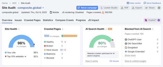
Composite recommends tools like:
Google Search Console and PageSpeed Insights
Microsoft Clarity for heatmaps and interaction data
Semrush or Ahrefs for SEO and site health
Built-in Webflow audits for performance and accessibility
Treat your site like a product. Monitor it, test it, improve it.
6. Webflow: Built for the Way You Build Now
Whether you’re a lean startup or an enterprise team, Webflow gives you design freedom without sacrificing structure. That’s why Composite uses it for nearly every project we ship—especially for clients in AI, fintech, and medtech.
Here’s why:
Design systems made simple – Components, styles, and CMS structure all in one place.
Visual collaboration – No more back-and-forth over static mockups.
In 2025, vector databases are no longer a niche tool reserved for AI researchers or machine learning engineers. They’re becoming essential for modern web developers, especially as applications increasingly rely on AI-powered search, recommendation systems, and semantic data retrieval. Whether you’re building an e-commerce site, a chatbot, or a content discovery platform, understanding vector databases is now part of staying competitive.
Here’s what every web developer should know about vector databases in 2025.
What Are Vector Databases?
Unlike traditional databases that use relational schemas and keywords, vector databases store data as high-dimensional vectors—numerical representations generated by AI models like OpenAI’s embedding APIs or other large language models (LLMs).
Each item—be it an image, text snippet, or product description—is encoded into a vector. These vectors capture semantic meaning, enabling similarity-based search. Instead of querying “red shoes” and matching exact keywords, a vector database finds items that are contextually similar, such as “burgundy trainers” or “scarlet sneakers.”
Why Should Web Developers Care?
AI-Driven Experiences Are Becoming Standard In 2025, users expect intelligent search and recommendations. Whether it’s finding a product, answering a query, or generating content suggestions, traditional keyword-based search falls short. Vector databases allow developers to implement natural language search and context-aware features that feel more intuitive.
LLMs and Embeddings Are Mainstream Web dev stacks now regularly include calls to APIs like OpenAI’s or Cohere’s embedding services. Vector databases like Pinecone, Weaviate, Qdrant, or Chroma integrate seamlessly with these APIs, making it easier than ever to store and query vector representations.
Serverless and Edge Compatibility Leading vector databases now offer serverless options and edge deployment, enabling low-latency semantic search directly within modern frontend frameworks like Next.js, Astro, or SvelteKit. That means you can build smart UIs without sacrificing speed.
Key Use Cases for Web Developers
Semantic Search: Implement Google-like search on your app or site without needing a complex backend. A user searching “how to fix a dripping tap” can be matched to content titled “stop a faucet leak” using vectors.
Product Recommendations: Use user behaviour or product descriptions to recommend similar items—even if the exact keywords don’t match.
Chatbots with Memory: Store conversation chunks or knowledge base documents in vector form to enable context-aware responses in AI chatbots.
Content Discovery: Build Spotify-like features for blogs, videos, or educational content, suggesting semantically similar material in real time.
Tools & Frameworks Making It Easy in 2025
The learning curve for vector databases has dropped dramatically. Here’s what’s new:
LangChain, LlamaIndex, and Dust: These tools abstract away complex vector handling and now integrate with major front-end frameworks.
Vercel AI SDK and Clerk: You can integrate authentication, vector-based search, and AI completions directly into your frontend stack.
Open Source Vector DBs: Tools like Chroma and Qdrant offer lightweight options ideal for side projects or early-stage apps.
Challenges to Watch
Despite the hype, vector databases aren’t a silver bullet. Key challenges include:
Index management: Vector indices can grow large and need pruning or retraining.
Security and PII concerns: Storing embedded representations of sensitive data needs careful handling, especially with GDPR and AI-specific regulations coming into effect.
Future-Proof Your Dev Skills
As web apps move beyond static content and into context-aware, AI-enhanced experiences, vector databases are becoming foundational. In 2025, knowing how to embed, store, and query vector data is as important as understanding REST APIs was a decade ago.
If you haven’t explored vector search yet, now’s the time. Whether you’re working solo, freelancing, or part of a dev team, vector databases can supercharge your applications and give users the intelligent interactions they expect in a world shaped by AI.
If you like this post, make sure to take some time to read through our blog section.
What Web Developers Need to Know About Vector Databases in 2025 was last modified: August 4th, 2025 by Sierra Knox
Custom web development solutions have become increasingly important as businesses strive to differentiate themselves in a crowded digital landscape. Off-the-shelf platforms often lack the flexibility and specificity required to meet unique business needs and user expectations. Tailored digital experiences provide the opportunity to design functionality and aesthetics that align precisely with organizational goals.
By investing in custom web development solutions, companies can create websites and applications optimized for performance, scalability, and user engagement. This approach allows for seamless integration with existing systems and the flexibility to adapt as business requirements evolve. Moreover, custom solutions enhance security and provide a competitive edge by delivering personalized experiences to users.
In today’s fast-paced environment, generic solutions are no longer sufficient. Tailored digital experiences crafted through custom web development solutions are vital for building meaningful connections with users, improving satisfaction, and ultimately driving sustainable growth and success.
What Custom Web Development Really Means for Your Business
What custom web development really means for your business is the creation of tailored digital solutions designed to meet specific goals and challenges. Unlike generic templates, custom web development solutions provide flexibility, scalability, and unique features that align perfectly with your brand and user needs.
By investing in custom development, businesses gain complete control over functionality and design, enabling them to differentiate themselves in a crowded marketplace. This approach allows for seamless integration with existing systems and future growth without the limitations often found in off-the-shelf products.
Moreover, custom web development solutions improve performance, security, and user experience, which are critical factors in retaining customers and driving conversions. Ultimately, embracing custom development empowers businesses to build a robust online presence that supports long-term success and adaptability in an ever-changing digital landscape.
Gapsy Studio’s Approach to Building Scalable, Future-Ready Websites
Gapsy Studio’s approach to building scalable, future-ready websites focuses on creating adaptable and efficient digital platforms that grow alongside businesses. By employing custom web development solutions, they ensure each website is uniquely tailored to meet specific requirements while maintaining flexibility for future updates and expansions.
Their process begins with thorough planning and understanding of the client’s goals, followed by the integration of modern technologies and best practices. This allows Gapsy Studio to deliver websites that are not only visually compelling but also highly functional and optimized for performance.
Emphasizing scalability, Gapsy Studio designs websites that can easily accommodate increased traffic, new features, and evolving user expectations. This forward-thinking strategy ensures long-term success and reduces the need for costly redesigns. Ultimately, their custom web development solutions empower businesses to maintain a strong digital presence that adapts to changing market demands.
The Hidden Costs of Template-Based Websites You Can Avoid
Template-based websites may seem like a cost-effective option initially, but they often carry hidden costs that can affect your business in the long run. Limited customization options restrict your ability to create a unique brand identity, making it difficult to stand out in a crowded market. Additionally, templates can lead to performance issues, slower load times, and poor user experience, which negatively impact search engine rankings and user retention.
Another challenge is scalability. As your business grows, template limitations may hinder adding new features or integrating advanced functionalities. This often results in costly redesigns or workarounds that could have been avoided with custom web development solutions.
Investing in custom web development solutions provides greater flexibility, better performance, and tailored functionality that align with your business goals. By avoiding the pitfalls of template-based websites, you ensure a more sustainable and effective online presence that supports growth and success.
Benefits of Tailored Solutions: Performance, Security, and Flexibility
Benefits of tailored solutions include enhanced performance, improved security, and greater flexibility, all of which are critical for modern digital products. Custom-designed systems are optimized to meet specific business needs, resulting in faster load times, smoother interactions, and overall better user experiences.
An award-winning UX and UI design studio understands that off-the-shelf solutions often fail to address unique challenges. Tailored designs allow for more robust security measures, protecting sensitive data and reducing vulnerabilities. This proactive approach ensures that digital products remain safe in an increasingly complex threat landscape.
Moreover, tailored solutions offer unmatched flexibility, enabling businesses to adapt and scale their products as requirements evolve. This adaptability is essential for staying competitive and responding to changing market demands. Ultimately, investing in tailored design services leads to more reliable, secure, and versatile digital experiences that support sustained growth and success.
Key Technologies Behind Custom Web Development at Gapsy Studio
Key technologies behind custom web development at Gapsy Studio enable the creation of highly functional and scalable digital solutions. These technologies provide the foundation for building websites that are both user-friendly and performance-optimized. By leveraging modern frameworks, programming languages, and tools, Gapsy Studio delivers tailored experiences that meet unique business requirements.
As an award-winning UX and UI design studio, Gapsy Studio integrates technologies such as React, Angular, and Vue for dynamic front-end development. On the back end, they utilize robust platforms like Node.js and Python to ensure reliable and efficient server-side performance. Additionally, content management systems and cloud services are employed to enhance flexibility and scalability.
This combination of advanced technologies allows Gapsy Studio to build custom websites that are secure, responsive, and easy to maintain. Ultimately, these technical capabilities empower clients to engage their audiences effectively and support ongoing digital growth.
Why User-Centric Development Is at the Heart of Every Project
User-centric development is at the heart of every successful project because it prioritizes the needs, behaviors, and preferences of the end users. This approach ensures that digital products are not only functional but also intuitive and enjoyable to use. By focusing on the user first, designers and developers create solutions that effectively solve real problems and enhance overall satisfaction.
An award-winning UX and UI design studio embraces user-centric development by conducting thorough research and continuous testing throughout the project lifecycle. This commitment helps identify pain points and opportunities for improvement, leading to more informed design decisions.
Placing users at the center of development fosters greater engagement, loyalty, and conversion rates. Ultimately, user-centric development results in products that align with both user expectations and business goals, ensuring long-term success in a competitive digital environment.
Real-World Examples of Custom Web Solutions That Deliver Results
Real-world examples of custom web solutions that deliver results demonstrate the significant impact tailored design can have on business performance. Custom solutions address specific challenges by integrating unique features and functionalities that off-the-shelf products often lack. This level of personalization enhances user experience and operational efficiency.
An award-winning UX and UI design studio utilizes detailed research and innovative techniques to create web solutions that align with clients’ goals. For instance, a custom e-commerce platform might streamline the purchasing process, increasing conversion rates. Similarly, a bespoke dashboard could provide real-time analytics, improving decision-making.
These examples illustrate how custom web design adapts to diverse industries and user needs, resulting in measurable improvements such as increased engagement, reduced bounce rates, and higher customer satisfaction. Ultimately, investing in custom web solutions helps businesses stand out in crowded markets and achieve sustainable growth through optimized digital experiences.
How to Know When It’s Time to Go Custom
Knowing when it’s time to go custom with your digital product design can significantly impact your business’s success. Off-the-shelf solutions may work initially, but as your needs become more specific, a tailored approach often becomes necessary. Custom design offers the flexibility to address unique challenges and deliver a user experience that aligns perfectly with your brand and goals.
An award-winning UX and UI design studio can help identify when customization is the right choice. Signs include the need for specialized functionality, scalability requirements, or the desire to differentiate your product in a crowded market. Additionally, if your current design limits growth or fails to engage users effectively, it may be time to consider a custom solution.
Choosing custom design enables businesses to innovate freely, optimize performance, and create memorable experiences that standard templates cannot provide. This strategic decision supports long-term growth and competitive advantage.
Final Thoughts: Invest in Custom Development for Long-Term Digital Success
Investing in custom development is a strategic decision that can significantly contribute to long-term digital success. Unlike off-the-shelf solutions, custom development offers tailored functionality designed specifically to meet the unique needs of your business and users. This personalized approach ensures greater flexibility, scalability, and efficiency as your digital presence evolves.
An award-winning UX and UI design studio understands that custom development goes hand in hand with thoughtful design and user experience. By integrating bespoke software with intuitive interfaces, businesses can create seamless, engaging digital products that stand out in a crowded marketplace.
Custom development also facilitates easier updates and adaptations, allowing your digital assets to grow alongside changing market demands. Ultimately, investing in custom development is an investment in sustainability and innovation, positioning your business to achieve lasting competitive advantage and deliver exceptional user experiences for years to come.
Custom Web Development Solutions: Why Tailored Digital Experiences Matter More Than Ever was last modified: August 1st, 2025 by Tatiana Vita
A taken domain doesn’t mean your business idea is blocked
Variants and alternative extensions can work well with strong branding
Domain acquisition is possible but not always practical or affordable
Legal options exist if your name is trademarked and used in bad faith
You’ve locked in the business name, the logo’s looking sharp, and everything feels ready to go—until you check the domain and realize someone else got there first. It’s deflating. That name, the one that ties everything together, isn’t available. And worse, it’s not even in use. Just sitting there. It happens more often than you’d think, and when it does, it’s easy to feel stuck before you’ve even started.
But a taken domain doesn’t mean your idea is over. Plenty of successful brands have launched without their first-choice URL. The challenge is real, but the way forward is more flexible than it might seem.
What Happens When Someone Else Owns the Domain You Want
Sometimes it’s a competing business. At other times, it’s a random blog from 2009 that hasn’t been updated since. In some cases, it’s a domain squatter sitting on dozens of names, hoping someone will pay a premium. However, regardless of who owns it, the effect on you remains the same: you must make a decision.
This is where business planning intersects with online infrastructure. A domain isn’t just a web address. It signals credibility, helps with searchability, and supports brand recall. So when the exact match is off the table, the next move depends on how central that name is to your business identity.
You might find yourself weighing variations, examining country-level domains, or considering whether that .com matters. In this stage, it can help to generate hundreds of domain ideas fast, especially when you’re testing small tweaks that still feel true to your brand. Either way, knowing your options puts you back in control.
Making the Next Move
Before rushing into workarounds, it helps to pause and map out what matters most to your customers. Will they remember a different extension? Could you tweak the domain slightly without confusing people? These questions are more important than trying to win a URL battle that might go nowhere.
In some cases, registering a domain name for your business becomes a question of priority. If your chosen name is central to your brand identity, it might be worth tracking the domain over time or contacting the current owner. If not, securing a close name—and one that is available—can get you online faster, with far less stress. Some founders even find the modified version grows on them, especially once the rest of their branding falls into place.
Domain Parking, Expiry, and Acquisition Attempts
When a domain is taken but unused, it’s often parked. That means someone registered it but isn’t actively building a site. Sometimes it’s a placeholder with ads, sometimes just a blank page. Either way, parked domains can still be bought, though whether that’s worth pursuing depends on your budget and patience.
One approach is to monitor the domain’s status. Tools like WHOIS can show when the domain is due to expire and who currently holds it. If it’s set to lapse, you might have the chance to register it later. That said, many registrars automatically renew domains, so waiting it out can be a long game with no guarantee.
If you’re interested in making an offer, there are also channels for that. Some registrars have built-in systems for contacting current owners. Please note that once you express interest, the price may increase. It’s also worth checking if the domain is part of a larger portfolio or is being held by someone who routinely resells. In those cases, the asking price might be steep and non-negotiable.
For businesses that can’t afford delays, these acquisition attempts are best treated as a parallel option rather than the main plan. You can still move forward while keeping an eye on opportunities in the background.
Legal Rights and Trademarks to Be Aware Of
If your business name is legally registered or trademarked, you might have more leverage than you realize. Domain ownership doesn’t override a valid trademark in most countries, including Australia. If someone is using your name in a way that could confuse customers or trade off your brand, you may be able to challenge it.
This area sits at the intersection of IP law and digital policy, so it’s not something to navigate on your own. A trademark lawyer can help you assess whether the domain’s use crosses legal lines. In some cases, you may be able to lodge a formal complaint through dispute resolution channels, such as the Uniform Domain-Name Dispute-Resolution Policy (UDRP). These processes exist specifically to address domain conflicts that involve bad faith or brand infringement.
Of course, not every situation involves a clear trademark violation. Many domain names are legitimately registered by individuals who secured them first. However, if your business has a clear legal basis, and mainly if the domain is being used misleadingly, you may have grounds to take action.
Building Your Brand Without the Exact Match
Many businesses never get the exact domain they wanted, yet still do just fine. The truth is, your domain is only one piece of how people find and remember you. What matters more is how consistently you present your brand across platforms and how easily customers can identify what you do.
Alternative domain extensions, such as .net, .co, or .com.au, can still carry weight, especially in local markets. A memorable name with a slightly different extension is often more effective than a clunky workaround just to keep a .com. As long as your brand messaging is clear and your site ranks well, most users won’t even notice.
Consistency is key. Ensure that your domain, even if modified, aligns with your branding across social media, email, and marketing materials. Over time, that consistency builds recognition. It’s also worth remembering that names grow into brands. The most significant players today often started with imperfect domains and built their presence around them.
If you’re putting energy into strong content, good customer experience, and a recognizable identity, the domain becomes part of the picture, not the whole story.
What Happens When Someone Else Owns the Domain You Want was last modified: February 13th, 2026 by Linkin Pubal
In today’s fast-paced digital world, your website is often the first impression people have of your business. It’s your digital storefront, your brand voice, and a critical player in how you rank on search engines like Google. But here’s the catch: launching a beautiful website isn’t a one-and-done deal. If you want to stay relevant, competitive, and visible in search results, you need to keep it updated.
So, how often should you update your website to stay competitive in search rankings?
Let’s break it down.
Why Regular Website Updates Matter
Search engines love fresh content. Google’s algorithm, for instance, is designed to reward websites that consistently provide value and demonstrate relevance. If your site sits idle for months (or years), chances are it will slowly slide down the rankings—even if it looked great when it launched.
Regular updates can involve a mix of:
Content refreshes
Design improvements
Performance optimizations
Security patches and plugin updates
SEO adjustments
These changes not only please search engines but also improve user experience, which in turn can reduce bounce rates and boost conversions.
Frequency of Website Updates: What’s Ideal?
There’s no universal rulebook that says “update your website every 30 days,” but there are some helpful guidelines depending on the type of updates you’re making.
1. Content Updates (Weekly to Monthly)
Content is the easiest and most effective way to show search engines that your site is active. This could mean publishing blog posts, updating service pages, refreshing product descriptions, or even tweaking homepage messaging based on new offers.
If your website includes a blog or news section, aim to publish at least once a week or biweekly. Businesses that blog regularly tend to receive more leads and better search visibility. Not only does this strategy provide new content for Google to index, but it also gives your audience a reason to keep returning.
2. Design & UX Refresh (Every 2–3 Years)
Trends in web design change fast. What looked modern in 2021 may now feel outdated or clunky. Regularly assessing your site’s design ensures it stays visually appealing and aligned with user expectations.
This is where professional website design services come in handy. Designers can help modernize your layout, streamline navigation, and make your site more mobile-friendly—all factors that influence SEO and user engagement.
Even minor visual updates, like changing fonts or optimizing image sizes, can have a significant impact on load speed and user satisfaction.
3. Technical & SEO Maintenance (Monthly to Quarterly)
Your website’s technical health is the backbone of your SEO strategy. Broken links, outdated plugins, and slow page speeds can all harm your rankings.
If your site runs on WordPress (as many do), routine care is a must. Quality WordPress maintenance services typically include plugin and theme updates, backups, performance checks, and security scans. These services can save you from potential downtime, malware attacks, or compatibility issues that could hurt your search performance.
For SEO, consider doing an audit every 3–4 months. Tools like Google Search Console, Ahrefs, or SEMrush can help you identify areas for improvement, such as keyword performance, mobile usability, and page speed.
4. Security Updates (As Needed, Typically Monthly)
Hackers don’t take vacations. A site that hasn’t been patched or secured in months is a prime target. And once your site is compromised, it’s not just your data at risk—Google may also blacklist you, which thanks to your search visibility.
Security updates should happen as soon as new vulnerabilities are discovered. Again, reliable WordPress maintenance takes the hassle out of this by handling it proactively in the background.
Signs It’s Time for a Bigger Website Update
While smaller, routine updates keep things running smoothly, sometimes a more comprehensive overhaul is necessary. Here are a few signs your website might need a deeper refresh:
Your bounce rate is increasing and users aren’t staying long.
Your site isn’t mobile-friendly or accessible.
You haven’t updated the design in 2+ years.
You’ve rebranded, added new services, or shifted your business focus.
Your competitors’ websites look significantly better or more modern.
You’re not ranking for keywords you used to dominate.
If any of these sound familiar, it might be time to invest in both website design services and a strategic SEO or content upgrade.
Case Study: How Consistent Updates Turned Around SEO Performance
A mid-sized B2B service provider noticed a 40% drop in organic traffic over a 12-month span. Despite having a clean design, the site hadn’t seen any major updates in over two years. Here’s what they did:
Content Strategy: They created a weekly blog calendar, focused on FAQs and industry insights.
Technical Fixes: An audit revealed broken links, outdated schema markup, and poor mobile speed scores—all were corrected.
Design Tweaks: While the core design remained, UX improvements like clearer CTAs, lighter images, and a simplified menu made the site more user-friendly.
Security & Maintenance: Regular plugin updates, backups, and malware scans were automated using a managed service.
The results? Within 6 months:
Organic traffic increased by 57%
Bounce rate dropped by 22%
Several lost keywords returned to page one rankings
This shows how ongoing, strategic website maintenance can reverse declining performance and deliver tangible business results.
Tips to Keep Your Website Fresh and Competitive
Updating your site doesn’t have to be overwhelming. Here are some practical ways to stay ahead:
1. Set a Content Calendar
Plan blog posts, news updates, and social integration in advance. A consistent publishing schedule helps maintain authority and relevance in your niche.
2. Monitor Analytics
Track your most visited pages and identify where users are dropping off. Tools like Google Analytics and Hotjar can offer powerful insights.
3. Use Heatmaps and User Feedback
Find out how users interact with your site. Are they clicking where you expect? Is your call-to-action being ignored? These insights can guide effective design tweaks.
4. Keep an Eye on Competitors
Look at what your competitors are doing. Are they using new features like chatbots or AI-based search? Are they publishing video content or interactive tools? Use this as inspiration for your next update.
5. Automate Where Possible
With services like WordPress maintenance services, you can automate many of the tedious but critical tasks like backups, plugin updates, and performance monitoring.
Conclusion: A Living, Breathing Digital Asset
Your website shouldn’t be treated like a static business card—it’s a living, evolving asset. Whether you’re trying to improve user experience, climb the ranks in search results, or simply reflect your latest offerings, frequent and thoughtful updates are non-negotiable.
Investing in professional design and consistent site maintenance ensures your site isn’t just staying afloat—it’s actively competing and converting. The digital landscape is always shifting, and the brands that adapt quickly are the ones that thrive.
So, how often should you update your website?
As often as needed to stay relevant—and at least regularly enough that your customers and Google know you’re still in the game.
How Often Should You Update Your Website to Stay Competitive in Search Results? was last modified: June 10th, 2025 by Rosy Wilson
Having a website isn’t enough for businesses these days. Millions compete for user attention, and brands can only stand out through search engine optimization or SEO-friendly web design.
Your site must help search engines understand your content while improving user experience. This, in turn, boosts your search engine rankings, drives organic traffic, and increases conversion rates. But it’s not as easy as it sounds.
Transforming your website into an SEO powerhouse requires methodical implementation of technical best practices alongside user-centered design principles. This guide will walk you through the basics of site optimization, the best practices to follow, and the common pitfalls to avoid.
What Makes a Web Design “SEO-Friendly”?
SEO-friendly website design represents the intersection of technical optimization and user-centered design principles. At its core, it involves creating websites that are simultaneously accessible to search engine crawlers and delightful for human visitors. This dual focus requires a thoughtful approach to site architecture, where the underlying code structure supports efficient indexing while the visual and interactive elements engage users effectively.
A great web design prioritizes clean, semantic hypertext markup language (HTML) that organizes content in a logical hierarchy, making it easily interpretable by search algorithms. It also emphasizes performance optimization through compressed assets, efficient loading patterns, and responsive layouts that adapt seamlessly across devices. By implementing these technical standards, professional web design Chicago experts ensure that local businesses not only look professional but also achieve the high visibility and speed necessary to compete in a crowded digital marketplace.
Additionally, proper URL structuring, breadcrumb navigation, and strategic internal linking contribute to a cohesive user journey that both visitors and search engines can follow. Most well-performing sites hide these technical elements invisibly behind an intuitive, accessible interface that prioritizes content clarity and user satisfaction.
When seeking a partner for your digital transformation, invest in affordable web design services that prioritize SEO success. Service providers like this company combine technical expertise with stunning visual design to create websites that rank well and convert visitors into customers.
The Role of Google’s Algorithms in Ranking Websites
Google’s search algorithms are sophisticated evaluation systems that continually evolve. They aim to better match users with the most relevant and valuable content. Algorithms process hundreds of signals to determine how pages should rank for specific queries, with an increasing emphasis on holistic quality rather than isolated technical factors.
Over the years, Google has shifted from simple keyword matching toward understanding search intent through natural language processing systems like BERT and MUM, which analyze context and semantic relationships.
Core Web Vitals have emerged as critical metrics, measuring real-world user experience through loading performance, interactivity, and visual stability. The move to mobile-first indexing reflects changing user behaviors and prioritizes how sites perform on smartphones over desktop experiences.
Meanwhile, E-E-A-T principles (Experience, Expertise, Authoritativeness, Trustworthiness) have become increasingly important for evaluating content quality, especially for topics that could impact users’ well-being.
Each algorithmic update refines how search engines like Google interpret these signals, with major changes like the Helpful Content Update specifically targeting content created primarily for search engines rather than humans.
How Website Design Impacts Search Rankings
Web design decisions directly influence how search engines evaluate and rank websites. It represents the relationship between aesthetic choices and technical performance. Here’s how design elements affect search visibility:
Site architecture: Proper hierarchy helps search engines understand content relationships and importance, with clear pathways enabling efficient crawling.
Page speed: Design elements like large unoptimized images, excessive JavaScript, and third-party scripts can significantly impact loading times and user experience scores.
Code quality: Clean, minimalist code improves crawlability and indexing efficiency while reducing rendering time.
Content presentation: Proper formatting with strategic heading structure, readable fonts, and appropriate contrast improves accessibility for both users and search engines.
Internal linking: Strategic internal links distribute page authority throughout the site and guide users to related content, reducing bounce rates.
Schema markup: Structured data implementation helps search engines understand content context, potentially enabling rich results in search listings.
Technical SEO elements: Proper implementation of canonical tags, XML sitemaps, and robots.txt directives helps search engines navigate and index content appropriately.
Effective websites seamlessly integrate these technical elements with visually appealing designs. Doing so creates experiences that satisfy both search algorithms and human visitors. Businesses must prioritize this, considering the importance of SEO in achieving online marketing goals.
User Experience (UX) as a Ranking Factor
User experience has evolved from a secondary consideration to a central ranking factor. Algorithms have become increasingly sophisticated at evaluating how real people interact with websites. These platforms assess the following elements to deliver the most valuable search results:
Engagement metrics: Time on site, bounce rate, and pages per session signal content quality and relevance to user queries.
Navigation design: Intuitive menus and site structure help users find information quickly, reducing frustration and abandonment.
Content accessibility: Easy-to-read content with proper formatting and visual hierarchy ensures information is available to all users.
Page layout stability: Minimal content shifts during loading, as measured by Cumulative Layout Shift, prevent frustrating user experiences.
Interactivity: First Input Delay evaluates quick response to user interactions. Tracking this metric guarantees your site’s responsiveness and reliability.
Visual appeal: Professional design builds trust and encourages longer engagement with content.
Conversion optimization: Clear calls-to-action and user flows that fulfill visitor intent indicate that the site successfully serves user needs.
Google’s increasing emphasis on these UX factors represents a fundamental shift in SEO strategy. Websites must now prioritize creating genuinely helpful and accessible experiences rather than focusing exclusively on keywords and backlinks.
Building an SEO-Friendly Website: A Step-by-Step Guide
A well-designed website should be functional, easy to navigate, and optimized for search engine visibility. Here are the necessary steps to achieve this:
Step #1: Plan Your Design Strategy
Strategic planning establishes the foundation for SEO success. This critical first phase requires thoughtful consideration of both user needs and search engine requirements.
· Identify your target audience and their search intent: Research demographic information, browsing habits, and the specific questions your potential visitors are asking online. Understanding why users search for particular terms helps you create content that satisfies their needs rather than simply targeting keywords.
Build high-intent traffic with guest posts, affiliate links, and other off-site marketing channels. Your additional SEO strategies should include gaining quality backlinks from reputable sites.
· Choose an SEO-friendly content management system (CMS): Select platforms that offer built-in SEO capabilities, such as customizable permalinks, XML sitemap generation, and responsive design options. The right CMS simplifies ongoing optimization and makes technical SEO management more accessible.
· Work with a development team that understands SEO best practices: Ensure your developers prioritize clean code, proper semantic markup, and performance optimization from the beginning. Developers with SEO knowledge will implement technical best practices during construction rather than requiring costly fixes later.
Step #2: Optimize for Mobile and Speed
Site performance has evolved from a technical consideration to a critical ranking factor that directly impacts both user experience and search visibility. Speed optimization represents one of the highest ROI activities for improving search rankings.
· Use a responsive design that adjusts to different screen sizes: Implement flexible layouts that automatically adapt to various devices without sacrificing functionality or content. Google’s mobile-first indexing means your site’s mobile experience now determines your rankings across all devices.
· Optimize image sizes, enable lazy loading, and minimize server requests: Compress and properly format images, defer loading of off-screen resources, and consolidate scripts and stylesheets to reduce hypertext transfer protocol (HTTP) requests. These optimizations dramatically improve load times, especially on mobile connections.
· Use CDNs (Content Delivery Networks) to enhance speed: CDNs significantly improve load times for international audiences and provide additional security benefits. Distribute your site’s static assets across a global network of servers to reduce distance-based latency and handle traffic spikes effectively.
Step #3: Implement SEO Best Practices
On-page optimization techniques ensure your content is properly structured and contextually relevant for both users and search engines. It maximizes the visibility of each page you create.
· Conduct keyword research and use keywords naturally: Identify high-value search terms with appropriate search volume and competition levels, then incorporate them organically into the content. Focus on semantic relevance rather than keyword density, using related terms and natural language.
Use keyword research tools instead to find key phrases that naturally fit into your blog posts and body content. Maintain a good keyword density and focus on actual user interactions rather than just content for search engines.
· Structure your URLs to be SEO-friendly: Create concise, descriptive URLs that include relevant keywords and logical folder structures. Avoid parameter-heavy URLs with session IDs or unnecessary numbers that complicate crawling and reduce click-through rates from search results.
· Optimize title tags, meta descriptions, and header tags: Craft compelling, keyword-rich titles of about 50-60 characters that encourage clicks. Meta descriptions should be within 150-160 characters. Also, use a logical header hierarchy (H1, H2, H3) to organize content and signal topical relationships.
Step #4: Improve Navigation and UX
Navigation architecture forms the backbone of your website’s user experience, determining how easily visitors can find information and how effectively search engines can discover and understand your content.
· Design an intuitive menu structure for easy navigation: Create clear, logically organized navigation menus that help users quickly find what they’re looking for. Limit main navigation options to prevent overwhelming visitors and consider using breadcrumbs for hierarchical context.
· Use internal linking to help users discover related content: Ensure smooth user navigation by optimizing internal links and outbound links. Strategically connect pages through contextual links to distribute page authority, guide user journeys, and help search engines discover content relationships. Focus on descriptive anchor text that provides meaningful context about the linked page. Don’t forget to regularly check and fix broken links using Google Search Console and other SEO tools.
· Create a logical site hierarchy to assist search engines in crawling: Organize content into thematic categories with a clear parent-child relationship between pages. Keep important content within 3-4 clicks of the homepage to ensure proper crawling and indexing.
Step #5: Regularly Monitor and Optimize Performance
SEO success requires continuous measurement and refinement as search algorithms evolve and competitive landscapes change. Establishing systematic monitoring processes ensures your website maintains and improves its search visibility over time.
· Utilize Google Analytics and Search Console to track performance: Regularly review key metrics, including organic traffic, conversion rates, average position, click-through rates, and crawl errors. Set up custom dashboards and alerts to identify issues and opportunities quickly.
· Update content regularly to stay relevant: Refresh existing content with new information, examples, and statistics to maintain topicality and demonstrate content freshness. Conduct regular content audits to identify underperforming pages that need improvement or consolidation.
· Monitor backlinks and disavow low-quality ones: Track your backlink profile to identify potentially harmful links from spammy sites or link networks. Use Google’s Disavow tool judiciously to address negative SEO attempts while focusing on earning high-quality, relevant backlinks.
Common Mistakes to Avoid
Even well-intentioned web designers can undermine their SEO efforts. This happens through overlooked technical issues and misguided design choices. Understanding these common pitfalls is essential for creating websites that deliver results:
Poor Mobile Optimization
If you don’t optimize your site for mobile users, it will suffer a lower search ranking due to the “mobile-first index” approach. A site that isn’t responsive will also have higher bounce rates because it frustrates users on mobile devices.
Slow Loading Speed
Pages that take too long to load can lead to high bounce rates, negatively affecting search engine rankings. To fix this, optimize image size, enable lazy loading, use built-in SEO tools, and reduce external CSS file dependencies.
Ignoring Proper URL Structure
Messy, unstructured URLs with random identifiers make it difficult for search engine crawlers and users to understand your content.
Keyword Stuffing
Overloading pages with target keywords can backfire. It makes content unreadable and harms SEO rankings.
Broken Links and Poor Navigation
Broken links frustrate users and harm SEO efforts. A website with too many broken links loses credibility and can result in a poor search feature experience.
Lack of Quality Backlinks
Backlinks play a crucial role in boosting your search ranking and SEO success. Without them, your site may struggle to rank higher.
Neglecting Analytics and SEO Metrics
Failing to track your site’s performance can lead to missed opportunities for optimization. Use advanced metrics and detailed reports to monitor SEO rankings, conversion rates, and qualified traffic. Regularly review your coverage report to address indexing problems.
The Competitive Edge of SEO-Friendly Design
Building an SEO-friendly web design isn’t just about appeasing search algorithms or ranking high on search engines. It’s about creating a seamless experience for your visitors. Balancing SEO and user-centered design helps your website become discoverable and memorable. That’s why getting it right is crucial to staying competitive in today’s crowded digital landscape.
The businesses that thrive online understand that SEO isn’t a one-time task but an ongoing commitment. As such, their websites constantly evolve alongside search behaviors and adapt to algorithm changes while staying true to user needs.
Embracing these principles transforms your online storefront from a passive digital brochure into a dynamic lead-generating asset that continuously attracts, engages, and converts your ideal customers—even while you’re sleeping.
What Is SEO-Friendly Web Design and How to Make One for Your Business was last modified: February 2nd, 2026 by Nora Sbalckiero