Some apps are easy to explain in one sentence. Others are not. Productivity apps are often doing three or four jobs at once: syncing data, reducing admin, coordinating people, and saving time in workflows that look ordinary on the surface but feel messy in real life.
That complexity creates a familiar App Store problem. The product may be genuinely useful, yet the screenshot gallery still reads like a pile of feature labels. New visitors see a calendar, a dashboard, a settings page, maybe a report view, but they never quite understand why the app would improve their day.
AppScreens is a browser-based App Store and Google Play screenshot generator. Teams can use it to turn interface captures into a gallery that explains what their app helps people do. For productivity software, that means showing the value of the workflow, not just the screens.
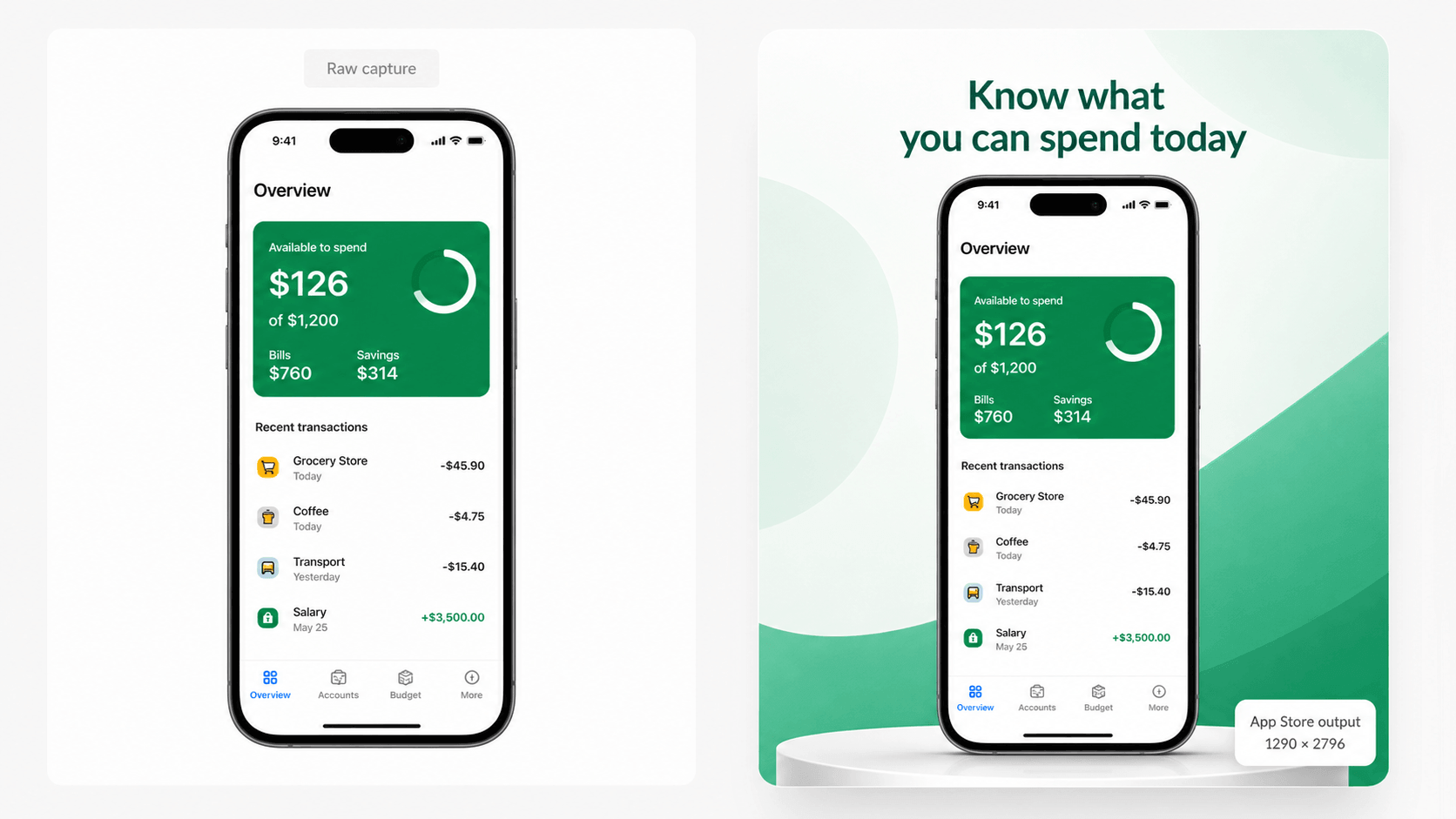
Complex workflows need clearer visual storytelling
The harder your app is to summarize, the more carefully your screenshots need to work. That sounds backwards at first. You might assume a complex app needs more detail. In practice, it usually needs more clarity.
A productivity app does not win attention by dumping every feature into the gallery. It wins by helping the viewer understand what gets easier after installation.
For example, a task app should not lead with “Custom labels.” A CRM companion should not lead with “Advanced filters.” A field-service app should not open with “Admin dashboard.” Those may be real features, but they are not the first reason someone cares.
A stronger opening sequence might sound more like this:
- Keep every client update in one timeline.
- Turn calls, notes, and tasks into one shared workflow.
- Pick up where you left off on any device.
Now the product feels useful before the viewer even studies the interface.
Why three screenshots are often enough to make the case
Productivity apps often try to solve clarity by adding more frames. The better solution is usually to make the opening frames work harder.
If the first three screenshots are well chosen, they can already answer the big questions:
- What kind of work does this app help me do?
- How does it reduce friction in that work?
- Why should I trust it over a spreadsheet, notes app, or current workaround?
That is enough to create momentum. Once the viewer understands the job the app is doing, later screenshots can expand on collaboration, customization, reporting, integrations, or premium features.
Without that early clarity, the rest of the gallery often becomes expensive wallpaper.
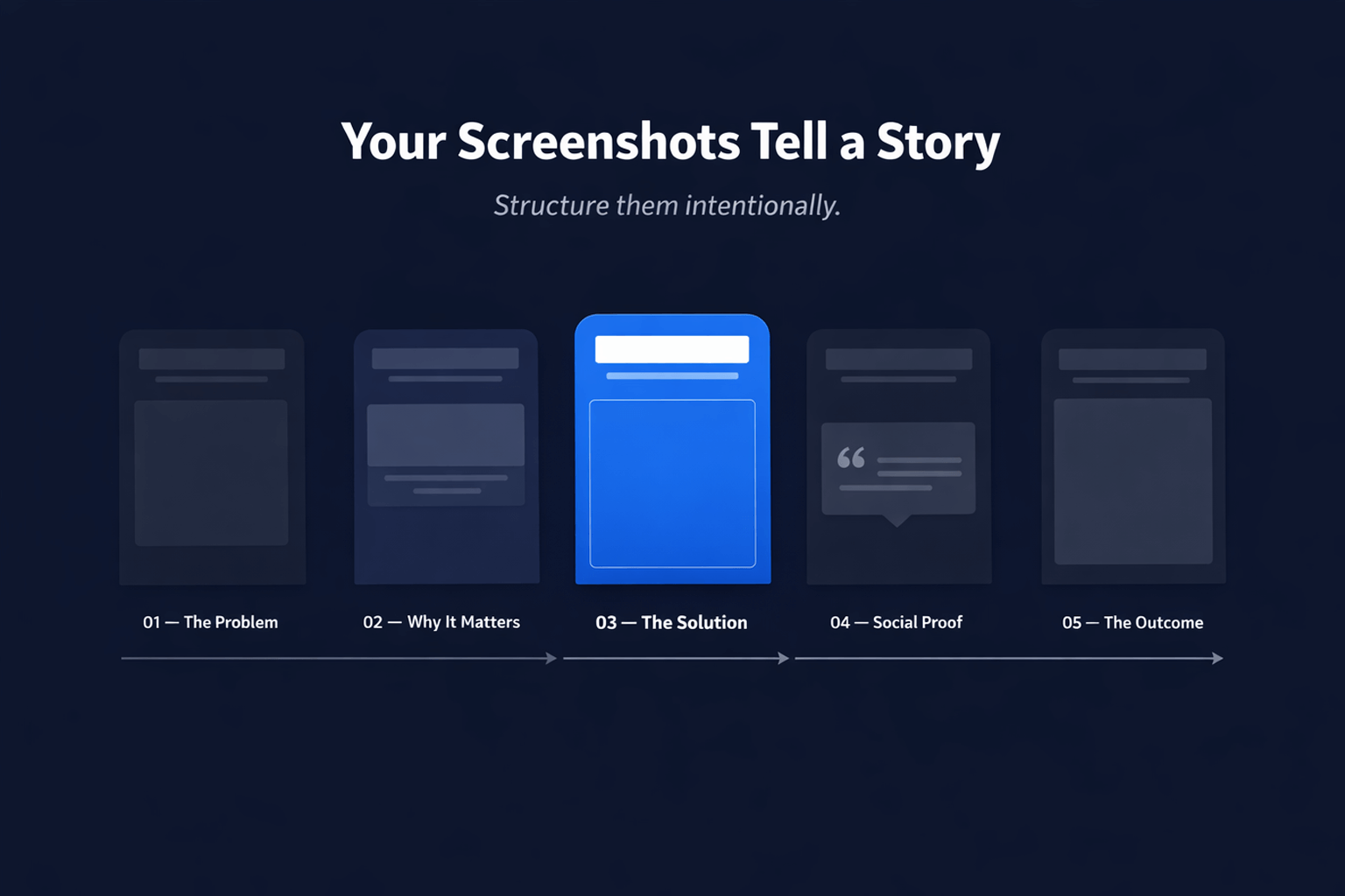
What usually goes wrong with productivity app galleries
Most weak screenshot sets for productivity apps have one of four problems:
- The captions describe screens instead of outcomes.
- The gallery assumes the viewer already knows the workflow.
- The screenshots repeat similar layouts without building a story.
- The app looks capable, but not obviously easier to use.
That last point matters more than people think. Productivity software competes against inertia. Users already have some workaround, even if it is clumsy. The screenshot set needs to show why changing habits is worth it.
In other words, screenshots for this category should not just say “Here are our features.” They should say “Here is how your day gets simpler.”
How AppScreens helps explain the work, not just decorate it
AppScreens is useful for this category because it combines the visual editor with a store-focused workflow. Teams can start with a template or blank canvas, bring in real app screens, write benefit-led captions, preview how the sequence reads, and keep the project editable across device sizes and future updates.
Keeping the project editable matters when the product changes. The feature set evolves. Copy gets sharper. One promise resonates better than another. A product that serves small businesses may eventually need more localized listings, more test variants, or a cleaner way to present the same workflow to different audiences.
When the screenshot project stays alive, those changes are manageable. When the gallery only exists as flattened exports, the team becomes reluctant to improve it.
Lead with what gets easier
The best productivity screenshots usually isolate one important before-and-after idea. Not literally as a comparison slide, but as a narrative shift.
Before the app:
- Notes are scattered.
- Follow-ups get missed.
- Work is hard to resume.
After the app:
- Everything related to the task is visible in one place.
- Next actions are obvious.
- The workflow can continue on mobile without friction.
That is a much stronger frame for screenshots than listing isolated functions. It also gives the team a way to judge whether each image is earning its slot. If a frame does not show what gets easier, it is probably not a top-six screenshot.
Use screenshots to reduce cognitive load
Ironically, many productivity apps create screenshot galleries that feel cognitively heavy. Dense text, small UI elements, and feature-stacked captions ask too much from the viewer.
A better gallery does the opposite. It lowers cognitive load. It gives each frame one main job. It uses plain language. It lets the interface support the promise rather than crowding it.
That is also where sequencing matters. A good set moves naturally from what the app helps with, to how it works, to why it is trustworthy. The user is not forced to decode everything at once.
AppScreens supports that kind of iteration well because teams can change captions, order, and layouts without rebuilding their whole asset library every time they want to test a sharper angle.
Check whether your gallery is clear before you publish
One smart habit is to audit the screenshot set before treating it as finished. Ask a simple question: if someone knew nothing about the app, would the first few screenshots explain the value fast enough?
If your app is already live, the free ASO review from AppScreens can help you assess the existing store listing before planning the next update. Use the feedback alongside a simple readability check: show the opening screenshots to someone unfamiliar with the app and ask what they think it does.
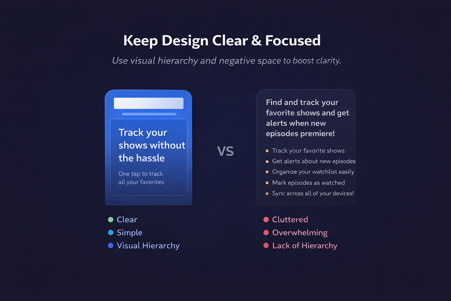
A practical screenshot framework for productivity apps
If your app helps people organize work, manage information, or keep projects moving, this structure is a good place to start:
- Screenshot 1: State the core job the app makes easier.
- Screenshot 2: Show the central workflow in action.
- Screenshot 3: Reinforce continuity, trust, or saved time.
- Screenshot 4: Show collaboration, sync, or cross-device continuity.
- Screenshot 5: Highlight customization or advanced control.
- Screenshot 6: Close with polish, reporting, or confidence.
That framework is simple, but it keeps the gallery focused on user value rather than a list of features.
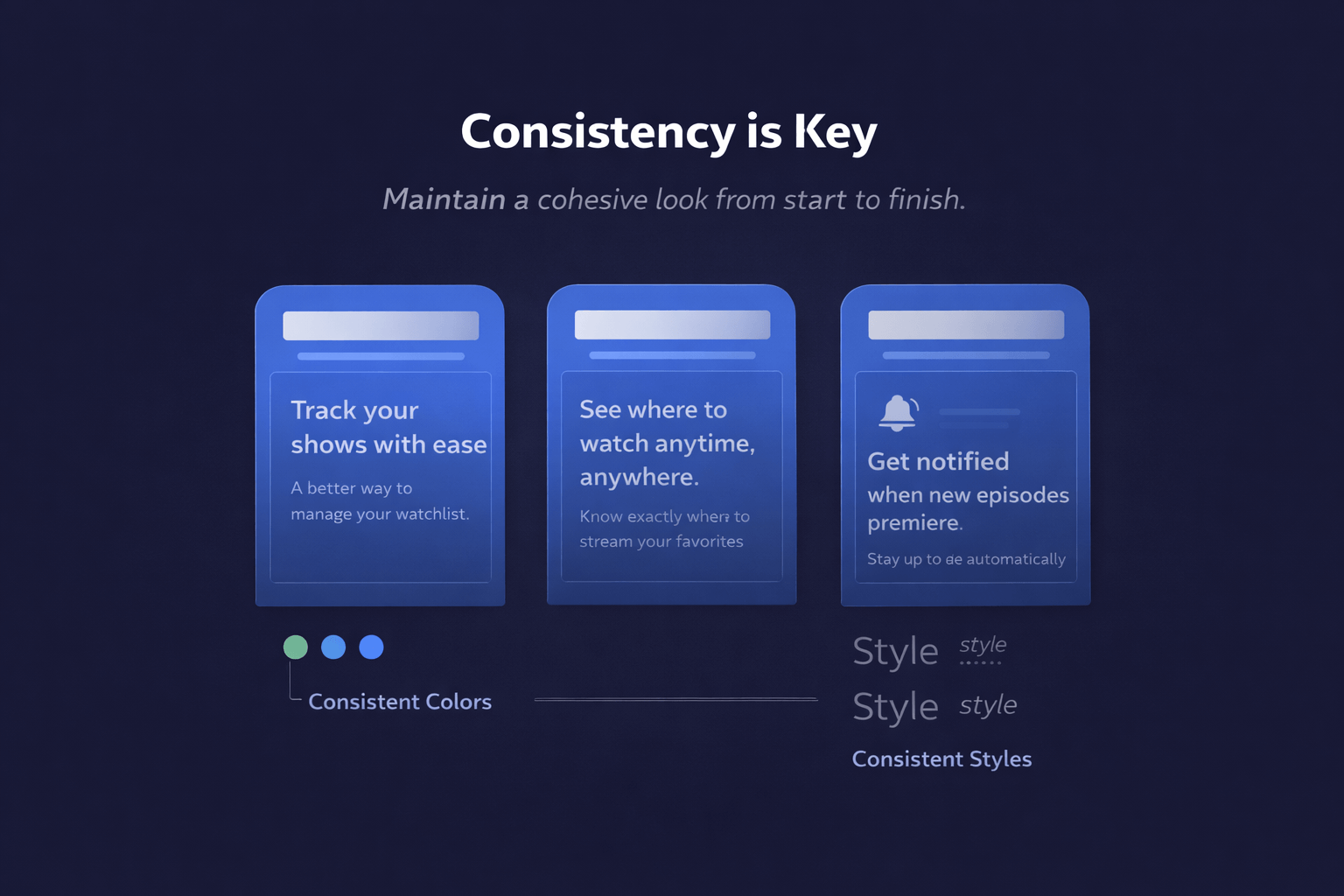
Final thought
The best productivity apps remove friction from complicated work. Their screenshot galleries should do the same. If the listing feels hard to scan or vague about the real benefit, the product is not being introduced well enough.
AppScreens works because it helps teams shape the story, not just the image files. For apps with layered workflows and practical benefits, that can be the difference between a gallery that looks busy and one that actually makes the install decision easier.
FAQ
Why are screenshots especially important for productivity apps?
Because these apps often solve complex, low-drama problems. The screenshot set has to make the value feel obvious quickly or the app can look more complicated than it really is.
What is AppScreens best at in this context?
It helps teams turn real app screens into a structured, editable App Store or Google Play gallery with stronger captions, better sequencing, and a workflow that survives future updates.
Should screenshots focus on features or outcomes?
Outcomes first. Features matter, but they work better when the user already understands what the app will make easier.
How can a team tell if its gallery is clear enough?
If a new visitor can understand the app’s purpose and main benefit from the first three screenshots, the gallery is usually on the right track. If not, the message probably needs tightening.